It may seem like choosing a color scheme for a child’s room is a simple task — just pick what you like the most and you’re done. However, selecting the right color is not just a matter of taste. What looks great on a color palette might not fit the overall style of the room or could appear completely different under varying lighting conditions. Color changes depending on the texture of materials, the size of the space, and how it interacts with other elements in the interior. These are the nuances we will discuss in today’s article.
A Professional Approach to Choosing Colors
In design studios, choosing colors for a child’s room is a meticulous process that takes many details into account. First, designers discuss the client’s preferences regarding the room’s style, mood, and functions, paying close attention to the space’s features and the child’s personality.
Next, a color concept is formed based on professional catalogs like Pantone or RAL. The selected shades are tested in real conditions by applying paint to the walls to assess how they look under different lighting.
Special attention is given to the harmony of colors with the materials of furniture, textiles, and decor. Afterward, a 3D visualization is created to give a clear picture of the final result. This approach ensures that the colors not only aesthetically fit into the space but also create a cozy and harmonious atmosphere for the child.
Key Aspects of Choosing Colors for a Child’s Room
Color Interaction
The chosen colors should harmoniously complement each other. It’s important that they support one another rather than compete for attention.
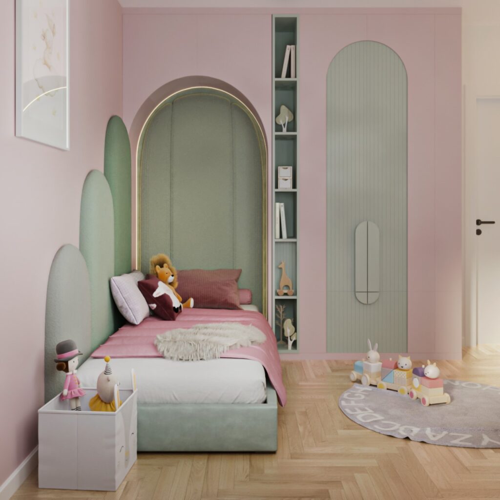
For example, a soft pastel pink pairs beautifully with a gentle blue, creating a calm and cozy atmosphere.
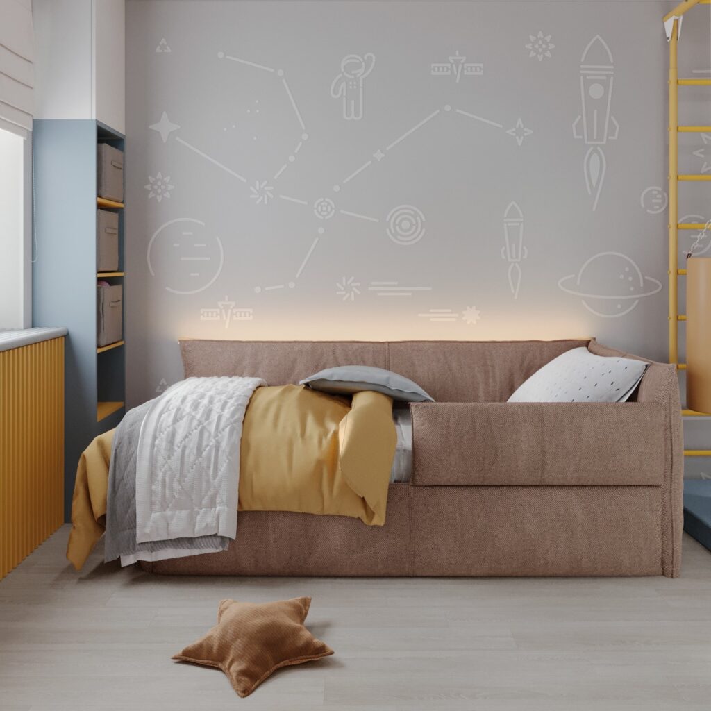
You can also choose a deep navy blue combined with gray shades or even green to create a peaceful yet engaging room.
Excessive Color
Sometimes, we may want to make the room as colorful as possible, but it’s important to maintain balance. An excess of color can overwhelm the space, creating a sense of chaos or even irritability.
It’s better to choose a few main colors and play with their shades and textures.
Selecting a primary color with a few accents in contrasting shades is a great option for a child’s room.
Consideration of Lighting
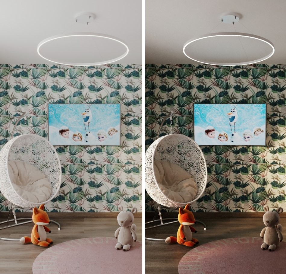
The color in a child’s room changes depending on the lighting. Throughout the day, the same color of furniture or wallpaper may look different depending on natural light, and in the evening, it can appear altered with backlighting or artificial lighting.
For example, warm colors like yellow or orange may appear more saturated under artificial light, while cool shades (blue, green) will look more subdued, emphasizing calmness and coziness.
It’s important to assess how the color will look in different lighting conditions throughout the day before making a final choice.
Texture and Color
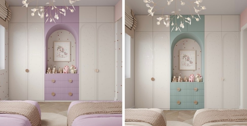
Colors also appear differently on various textures. For example, on glossy furniture, shades will look more vibrant and saturated, while on matte or textured surfaces, colors may appear more muted.
Therefore, when choosing a color for furniture or walls, it’s important to consider the type of texture. For instance, glossy cabinet doors can pair well with deep shades of blue or green, while textured wallpaper with pastel shades creates a harmonious and calm interior.
At our studio, FeliFam Kids Rooms, we always consider all these nuances when designing children’s rooms. We believe that every color, every shade plays a crucial role in creating a comfortable and functional space for children. By taking into account color interactions, lighting, texture, and color balance, we create rooms that foster a child’s development and provide a comfortable and safe environment.

